
Dynamic themes with Compose and Material 3
Dynamic colors with Compose and Material 3
In this article we will quickly learn how to use Jetpack Compose and Material design 3 library to build a theme for your app which uses colors generated by Material You on Android versions 12/12L and above.
This article covers:
- Generating Light and Dark themes
- Leveraging Jetpack Compose for dynamic behaviour
- Building your first theme
- Adapting your app to dynamic colors
Table of content
Dynamic colors of the Android system
The Android system starting from versions 12/12L now supports what we call dynamic theming. Essentialy as a part of the new user customization centric design experience, the Android framework will now extract colors from the wallpaper set on your device.
Monet is the logic within the framework that is responsible for color extraction from the wallpaper. It’s kind of fascinating to understand how Monet works under the hood, you can read more about the internals of how Monet provides dynamic colors to the Android system.
Project dependencies
To bootstrap the project, let’s add the following dependencies to the project for Jetpack compose and material 3.
    // Compose
    implementation "androidx.compose.ui:ui:1.1.1"
    implementation "androidx.compose.ui:ui-tooling-preview:1.1.1"

    // Material 3
    implementation "androidx.compose.material3:material3:1.0.0-alpha10"
Compose Material 3 is still in alpha at the time of writing this article.
Material theme builder
If you want the easiest way to use dynamic themes, head over to the site material theme builder. Its a really cool project on Github pages, which will help us get started, without manually preparing the theme files. Further down the article we will take a look at the files generated by the theme builder and also understand how we can manually prepare the theme ourselves.
Once you are on the theme builder site, navigate to the custom colors tab, and here we will prepare the base of our Composable theme. You will find options to select core colors of your application, these colors could be the colors that define your brand or application.
Once you have entered the RGB values, you should be able to export the colors. To export, click on the export option and select Jetpack Compose (Theme.kt).
This the easiest way availble right now to kickstart your project with dynamic theming. In the exported files you will find auto-generated Theme.kt, Colors.kt and Typography.kt files.
package com.example.compose
import androidx.compose.ui.graphics.Color


val md_theme_light_primary = Color(0xFF6750A4)
val md_theme_light_onPrimary = Color(0xFFFFFFFF)
val md_theme_light_primaryContainer = Color(0xFFEADDFF)
val md_theme_light_onPrimaryContainer = Color(0xFF21005D)
val md_theme_light_secondary = Color(0xFF625B71)
val md_theme_light_onSecondary = Color(0xFFFFFFFF)
.
.
.
.
.
Add the files to your project structure under ui/theme package and you are good to start migrating your project colors.
Alternatively you could just head over to this Github gist for the theme files and add your custom color hexcodes as you see fit.
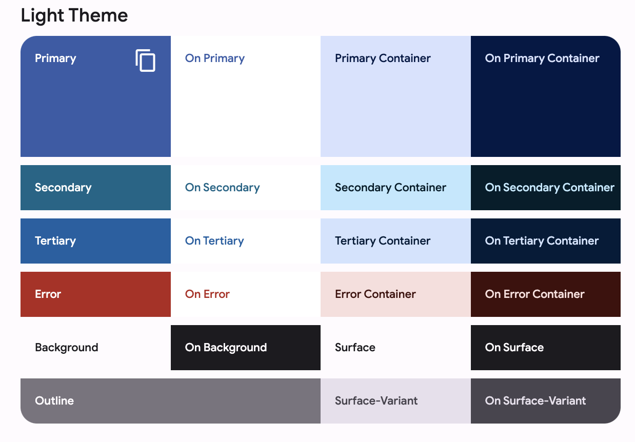
Building light and dark color schemes
M3 (Material 3) uses what we call as a baseline color scheme to begin with. This baseline color scheme consists of the following colors:
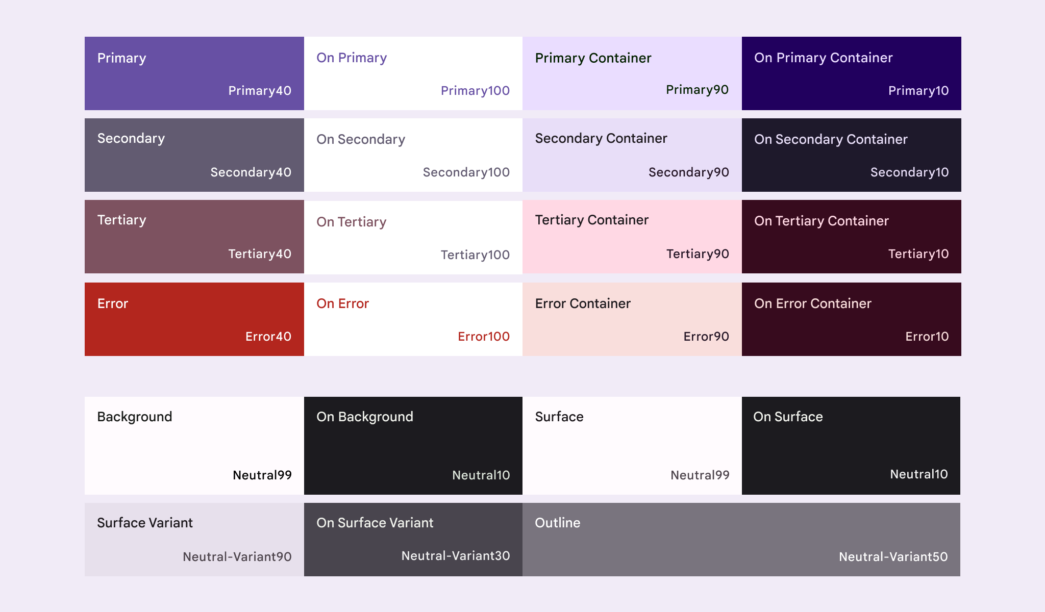
- Primary, Secondary and Tertiary
- On Primary, Secondary and Tertiary
- Primary, Secondary and Tertiary container
- Error, On Error, On Error Container
- Background, On Background
- Surface, On Surface and On surface container (Positive and inverse variants)
- Outline and shadow
Over in all, the baseline currently consists of about 26 colors / tokens for each of the theme variants, light and dark.
In our Theme.kt file we will prepare the light and dark composable color schemes. A color scheme is a state aware container class from the M3 library which holds the various colors we saw above.
import androidx.compose.material3.dynamicDarkColorScheme
import androidx.compose.material3.dynamicLightColorScheme

private val LightThemeColors = lightColorScheme(

    primary = md_theme_light_primary,
    onPrimary = md_theme_light_onPrimary,
    .
    .
    inversePrimary = md_theme_light_inversePrimary,
)

private val DarkThemeColors = darkColorScheme(
    primary = md_theme_dark_primary,
    onPrimary = md_theme_dark_onPrimary,
    .
    .
    inversePrimary = md_theme_dark_inversePrimary,
)The references to the colors above are the same ones we were able to export from the material theme builder, you can also customize the colors to your app or brands design guideline.
Dynamic theming
Up until now, we have been only looking at M3 library and preparing the colors for our app’s theme. Now that we have our M3 light and dark color schemes prepared, lets look at dynamic color schemes.
This is the easier part as M3 provides easy functions for accessing dynamic wallpaper colors. The DynamicTonalPalatte of the M3 library, provides TonalPalettes which encapsulate the dynamic system colors. We will use two functions
    fun dynamicDarkColorScheme(context: Context): ColorScheme

    fun dynamicLightColorScheme(context: Context): ColorScheme
Preparing your composable theme
To prepare your app wide theme composable, we need to be mindful of the following:
- Android API support
- System state (Dark or light mode)
We want our app to be backward compatible and design our theme in a manner that it should support dynamic colors if the API is or above SDK 31 (Android 12). We also need to take into account if the user has enabled or disabled dark mode, either manually or automatically based on time of the day.
// For checking API support, we could do a simple build SDK version check
fun supportsDynamic() : Boolean = Build.VERSION.SDK_INT >= Build.VERSION_CODES.S

// For checking system dark/light mode state, we use the utility from compose foundation
package androidx.compose.foundation

@Composable
@ReadOnlyComposable
fun isSystemInDarkTheme()
We can now write our AppTheme composable which wraps our entire UI, we use the above functions to check API support and enable or disable dynamic theming if SDK version in above 31 (Android 12). We also switch the color schemes to the darker palette if the system is in dark mode.
/**
 * App-wide dynamic theme
 * @param content [Composable] UI
 */
@Composable
fun AppTheme(content: @Composable() () -> Unit) {

    val inDarkMode: Boolean = isSystemInDarkTheme()

    val colors = if (supportsDynamic()) {
        val context = LocalContext.current
        if (inDarkMode) dynamicDarkColorScheme(context) else dynamicLightColorScheme(context)
    } else {
        if (inDarkMode) DarkThemeColors else LightThemeColors
    }

    MaterialTheme(
        colorScheme = colors,
        typography = AppTypography,
        content = content
    )
}
To use your theme, simply call it at the top layer / level of your screen
setContent {
    AppTheme {
        HomeScreen()
    }
}
Footnotes
We have learnt how to leverage M3 components, Jetpack compose and utilize the APIs on Android 12/12L and Tiramisu to build an app wide theme. 🙌🏼 🎉
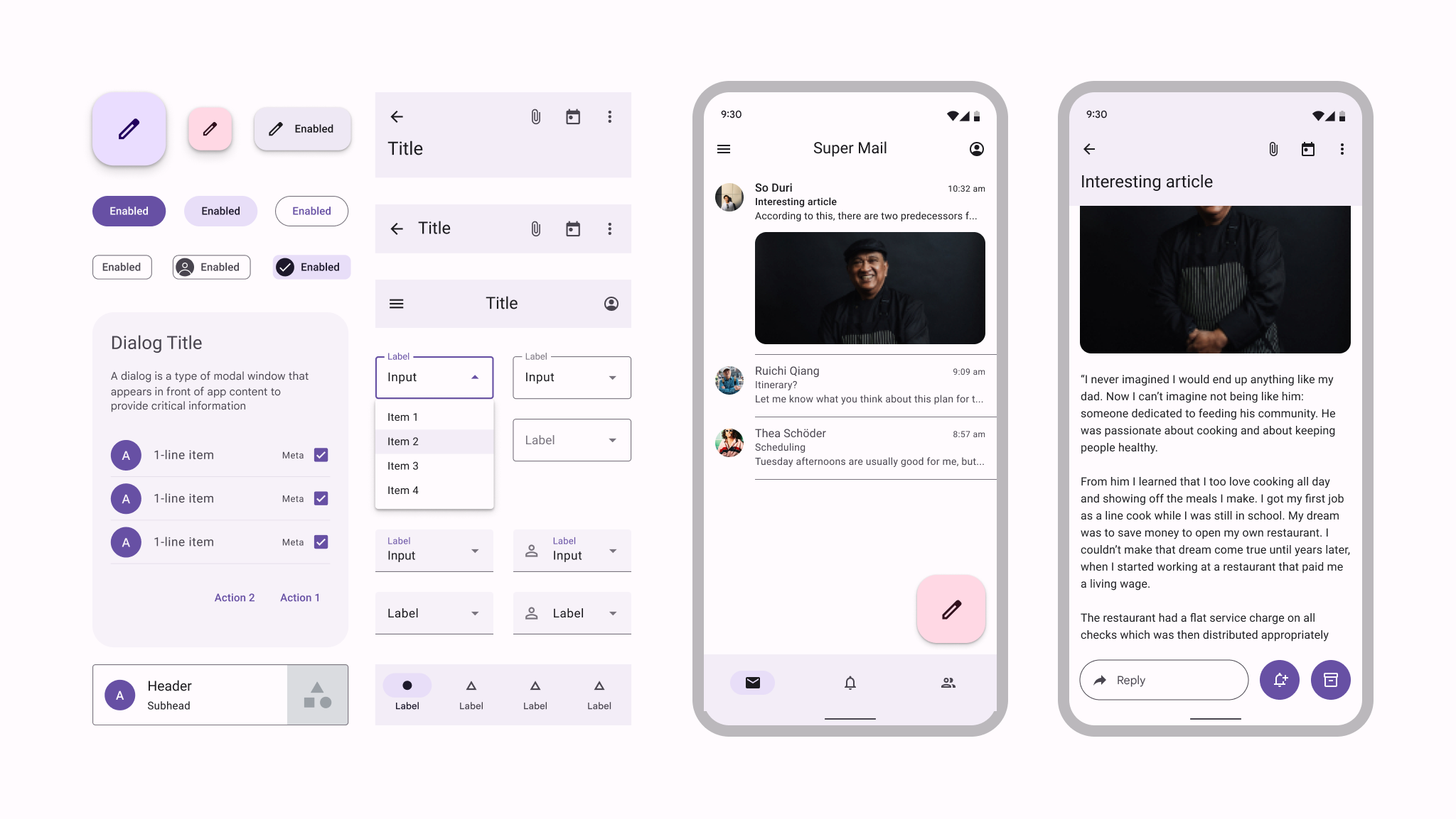
A sample of material 3 components from material.io
Hope you found this article helpful, if so do share it and add any feedback or questions you may have in the comments below. Cheers!
References
- M3 Color system and baselines
- M3 builder
- Code lab for XML version of migration to M3
- Compose release notes
- M3 release notes
Attributions
- Images from Material.io