Supporting adaptive themed icons on Android 13
Android 13 Tiramisu adds support for adaptive dynamic themed icons. You can now migrate your applications to add support for the dynamic behavior where your apps can change colors according to the system-wide theme.
Android 13 offers support for themed icons
I have extensively covered the internals of Monet on Android and also the new M3 design system with Jetpack compose. It’s an exciting time for the Android OS as the new design changes are arguably the best we have ever had.
Android has never looked this good!
Let’s explore the new changes in detail and learn how you can leverage them. We’ll look into the implementation, and specifications to understand how we can make our apps compatible with the new themed icon support on Android 13 Tiramisu.
Table of content
Themed icons? but why?
User customization and personalization are at the core of Material You. It is one of the fundamental building blocks of the design guideline. At the OS layer, the user should have control of how their launchers and home screens look. Just browse for the various icon packs on the Google Playstore and you’ll get a glimpse of how deep the rabbit hole for customization on Android goes.
In an attempt to make the user experience a bit more customizable, we arrive at Material you and native support on Android 13 for OS customization, primarily through dynamic UI behaviors.
So if you were to migrate your app, and add support for adaptive icons it would be for
- Giving the user more freedom of customization
- Participation in the overall OS UI design
- Preparing your apps for Android 13
I can understand how brands would want their icons to be easily recognizable among other apps by keeping their brand identity and colors intact. I would debate that it’s a user decision, they can always disable dynamic themed icons in launcher settings if they want to.
When would it work?
OEMs today can opt-in or opt-out of dynamic system theming with Monet. i.e. your device maker can choose to build your ROMs with support for dynamic theming or not. Secondly, a supporting launcher is required. The device home app launcher needs to support Monet and adaptive themed icons.
With that said, we are looking at the following requirements for themed icons to work
- Android 13
- Monet enabled by the device maker
- Launcher support
- App-level support
As the stable release of Android 13 rolls out soon and OEMs participate in the new feature sets and adapt their custom launchers to support dynamic theming, app developers can also choose to ride this bandwagon of customization.
Getting started
As an example, we will use Whatsapp, a popular messaging app, and migrate its icon to an adaptive themed icon. We start with the prerequisite understanding that your launcher icon already uses adaptive icons with a separate background and foreground asset.
If not, you can create separate resources like those shown below for foreground and background.
| Background | Foreground |
|---|---|

|

|
Launcher drawables in your project
app/src/main/res/drawable-v24/ic_launcher_background.xml
app/src/main/res/drawable-v24/ic_launcher_foreground.xml
Icon specifications
Our icon must be a VectorDrawable as seen above, with a maximum size of 108 x 108. The foreground icon has to be contained within these bounds with a maximum size of 44dp x 44dp.
These specifications ensure that your launcher icon will not end up looking too small or big and exceed the bounds of the maximum icon area.
Monochrome icon
The entire premise of how a themed icon would work is through the provision of a monochrome icon. The system can then dynamically set an icon background based on the colors generated from the wallpaper. Once the icon is ready with the given specifications, we can add this monochrome foreground icon to the launcher resource file.
/app/src/main/res/mipmap-anydpi-v26/ic_launcher.xml
    <?xml version="1.0" encoding="utf-8"?>
    <adaptive-icon xmlns:android="http://schemas.android.com/apk/res/android">
    <background android:drawable="@drawable/ic_launcher_background" />
    <foreground android:drawable="@drawable/ic_whatsapp_launcher" />
    ...
    <monochrome android:drawable="@drawable/ic_whatsapp_launcher" />
    ...
</adaptive-icon>If you are using a dedicated rounded launcher icon, then we must add the above monochrome drawable to the rounded icon resource file as well.
Degree of opacity
If your app icon is more complex than our example of WhatsApp and contains different depths, then we can work with different levels of opacity by setting appropriate alpha levels for paths in our VectorDrawable.
Here’s another example of the Snapseed app’s icon with different alpha levels in the drawable and its result.
| A vector with varying opacity levels | Dynamic themed icon with opacity levels |
|---|---|
|
|
The suggested guideline is to use a monochrome flat color icon, as it looks the best. You can figure this out with your design team to identify how your app's monochrome icon should look. In case your icon needs some depth, we can work with different opacity levels.
Comparison
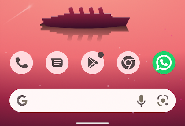
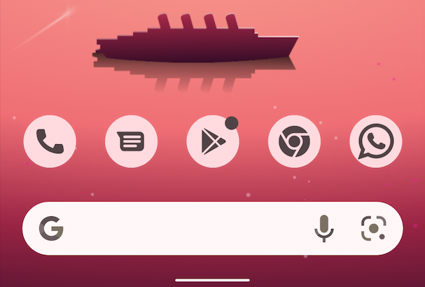
| Without dynamic color | With dynamic color |
|---|---|

|

|
The difference between the consistency of how the app icon looks with and without themed icon support is easily noticeable. We encourage this consistency in user experience! Precisely why you should consider migrating and adding support for the feature.
The result looks great and I can’t wait to see more apps supporting themed icons!
References
- New features in Android 13 Tiramisu
- Working with VectorDrawable on Android
- WhatsApp and Snapseed icons are used purely for reference as a sample case study and their trademarks or copyrights belong to the respective owners.
